North Range Financial Branding
Scope
North Range Financial partnered with me to develop a brand identity that would establish trust, reflect their values, and create a strong visual presence in the financial advisory space. The challenge was to design a brand that balanced stability and professionalism with warmth and approachability—qualities that resonate with their community-focused mission.
Creative Direction
My process began with uncovering the core values that truly define North Range Financial: community, trust, guidance, and approachability. These became the foundation for the creative direction.
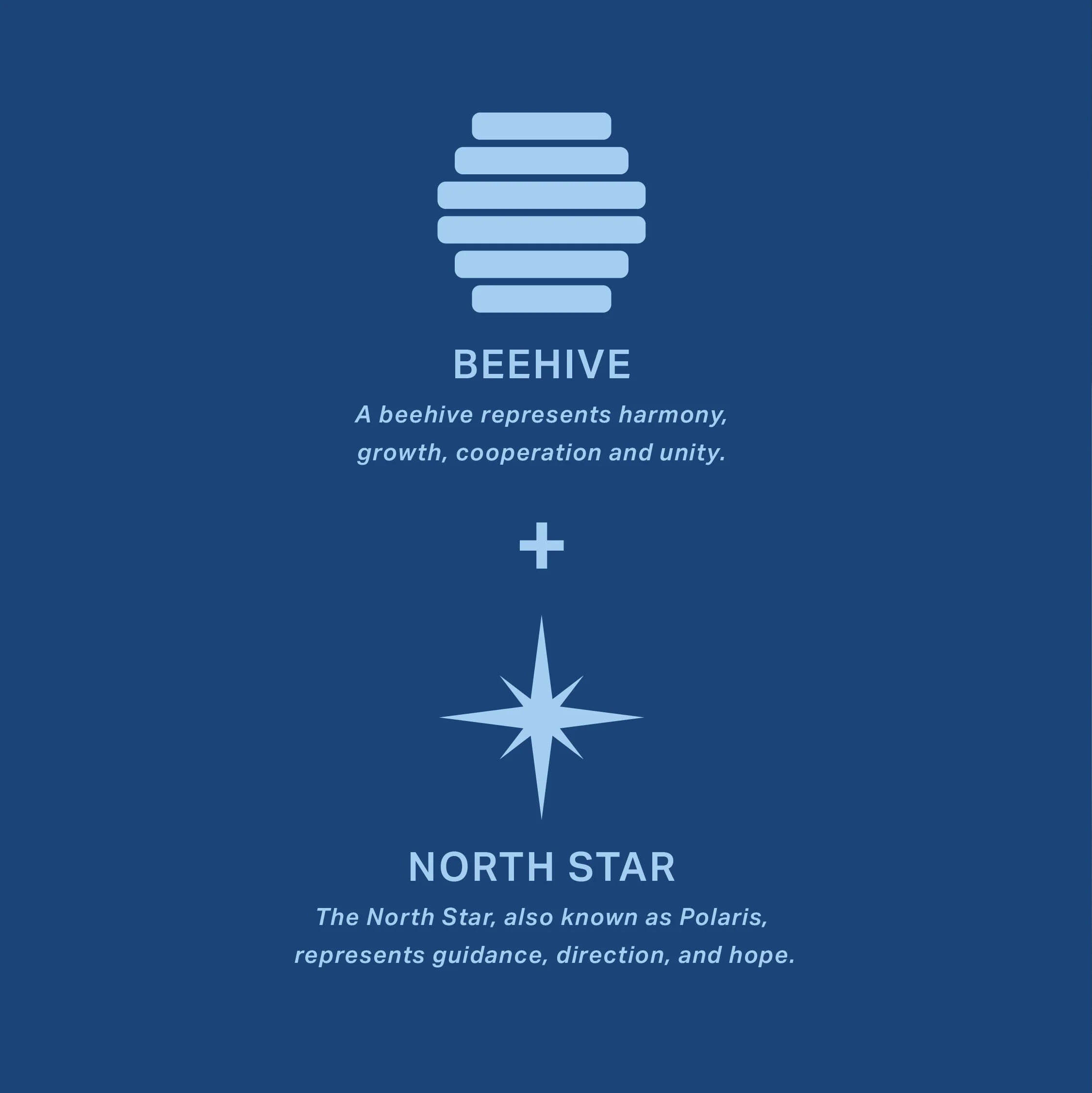
The logo design centered on two powerful, timeless symbols:
The North Star — a beacon of guidance, direction, and hope.
The Beehive — representing harmony, growth, and unity.
By combining these elements, I created a mark that feels approachable, trustworthy, and distinctly aligned with the North Range Financial name. The hexagonal forms, inspired by the hive, introduce structure and balance, while the confident blue palette reinforces intelligence, professionalism, and stability. Together, these elements craft a visual language that communicates both guidance and community.
Results
The new identity positions North Range Financial as a trusted partner for their clients, signaling trust and growth while maintaining a polished, professional aesthetic. The cohesive system—including logo, color palette, and supporting visuals—provides flexibility across digital and print applications. Most importantly, the brand now reflects the values North Range Financial stands for, helping them connect more authentically with their audience.
All work by: Jimmy Sugg


